
The most common mistake in Montessori playroom decor is treating the room as a display. Parents choose earth-toned furniture, arrange toys on open shelves, then fill the walls with framed art and seasonal hangings until the room feels layered and lively. It looks right. But the visual layer fights the same independence the furniture was meant to support. This guide covers the specific decor choices, covering colors, materials, rugs, lighting, walls, and textiles, grounded in the framework at Montessori playroom setup. A 2014 Carnegie Mellon study found children in heavily decorated classrooms were off-task 38.6% of the time, compared to 28.4% in visually sparse rooms.1
Quick Answer
What makes playroom decor Montessori-appropriate?
Montessori playroom decor uses a muted, nature-inspired color palette, natural materials (wood, linen, jute, cotton), and a visual hierarchy where the toys on the shelf hold the child’s attention. Lighting leans toward natural sources, supplemented with warm-spectrum lamps. Wall decor stays minimal and placed at the child’s eye level. The goal is a room the child reads at a glance, with the activities as the clearest signal in the space.1
Key Takeaways
- Natural materials (wood, linen, jute, cotton) and muted earth tones form the foundation of Montessori-appropriate playroom decor.
- Children in visually cluttered classrooms are off-task significantly more often and score lower on learning tasks than those in sparse environments (Fisher, Godwin and Seltman, Psychological Science, 2014).1
- Every decor element passes one filter: does it show the child what the space is for, or does it compete with the activities?
- Natural daylighting has an independent measurable effect, with children in well-lit classrooms progressing 26% faster on reading and 20% faster on math (Heschong Mahone Group, 1999).3
What Visual Preparation Means for Montessori Playroom Decor
In Montessori philosophy, the room itself teaches. At Playroom Architect, we call this the Third Teacher principle: the room is designed to support independence, focus, creativity, and better routines, actively guiding play rather than containing it passively. For the room to guide play, the child needs to be able to read it. A two-year-old takes in the whole wall before they see the shelf below it. When the wall competes for attention, the shelf loses.
Visual preparation in a Montessori context does not mean bare walls and empty floors. A well-prepared space has warmth, texture, and color. The distinction is between visual elements that belong to the child’s environment (the shelf and its activities, a low mirror, a small nature display at eye level) and visual elements added for adult aesthetic satisfaction (themed wall murals, gallery arrangements, seasonal bunting at adult height, character prints). The first category earns its place. The second category works against the room.
Research supports this direction. A 2022 study in Cognitive Science found the classroom visual environment “remained a significant source of off-task behavior even after 2 weeks of exposure,” even after children had time to habituate to the space.2 Children adapt partially to a busy visual environment. They never fully stop noticing it. The practical implication is that visual simplicity in a Montessori room is not a style preference – it is a functional design choice.
“Children in highly decorated classrooms were more distracted, spent more time off-task and demonstrated smaller learning gains than when the decorations were removed.”
Anna V. Fisher, Karrie E. Godwin, and Howard Seltman, Carnegie Mellon University, reported in Psychological Science, 20141
The functional and spatial principles underlying a Montessori-style room, including child-scale furniture, open floor space, and how ordered zones shape independent play, are covered in detail in the overview at Montessori design principles. This guide focuses specifically on the decor layer: color, material, light, and surface treatment.
Step 1: Set a Color Palette That Calms, Not Decorates
In a Montessori playroom, the color palette’s job is to recede. Earth tones, warm whites, soft sage greens, muted taupes, and natural linen neutrals are the right choices because they allow the toys on the shelf to hold the child’s visual attention. A heavily color-saturated room competes with the activities. The toys become one visual element among many rather than the clearest signal in the space.
Why Earth Tones Work: The Visual Hierarchy Principle
A 2014 Carnegie Mellon study found test accuracy dropped from 55% in visually sparse classrooms to 42% in heavily decorated ones, a 13-percentage-point difference from a single environmental variable.1 Color is one driver of that variable. Bright, high-contrast wall colors and bold accent pieces add stimulation the brain processes continuously, leaving fewer cognitive resources for the activity at hand. Earth tones and warm neutrals reduce this baseline visual demand, freeing attention for the work on the tray.
The Montessori approach to color is not “beige everything.” A deep sage, a warm terracotta, or a muted charcoal all work as accent tones, provided they appear on surfaces designed to stay in the background. Walls, large rugs, and curtains set the room’s visual atmosphere. Natural wood, ceramic, and plant life provide warmth and variation within a cohesive palette.
Building a Usable Palette
A practical three-part approach keeps the palette coherent without requiring interior design expertise. First, choose a wall color in the warm-white, taupe, or soft-greige range and apply it consistently to all four walls. Second, pick one grounded accent color for textiles, cushions, curtains, and small accessories: sage, terracotta, dusty blue, or ochre. Third, let the natural tones of wood shelving and woven fiber baskets supply warmth and variation without adding a third distinct color family.
This sequence leaves the toys as the most visually distinct objects in the room. The child’s eye goes to the shelf because the shelf holds color, shape, and variety against a quiet background. A room with three competing color families – bright yellow walls, teal accent cushions, and red toy storage – disperses attention across the whole space.
Step 2: Choose Natural Materials Over Synthetic Finishes
Natural materials – wood, linen, cotton, jute, wool, ceramic, and glass – are the backbone of Montessori playroom decor because they bring texture and warmth without visual noise. A solid oak shelf holds the eye differently than a white MDF one. Woven rattan baskets carry a visual weight a bright plastic bin does not. This difference is not aesthetic preference. It is about sensory calibration: natural materials speak quietly, leaving the activities on the shelf as the loudest signal in the room.
Research on cognitive load and visual processing supports this direction. When students encounter environments with high visual stimulation, their information processing becomes more fragmented, hindering simultaneous processing and preventing meaningful learning.5 Natural materials contribute to lower baseline stimulation. They introduce texture and warmth without the uniform, high-contrast surfaces of plastic and synthetic finishes.
Wood as the Primary Surface Material
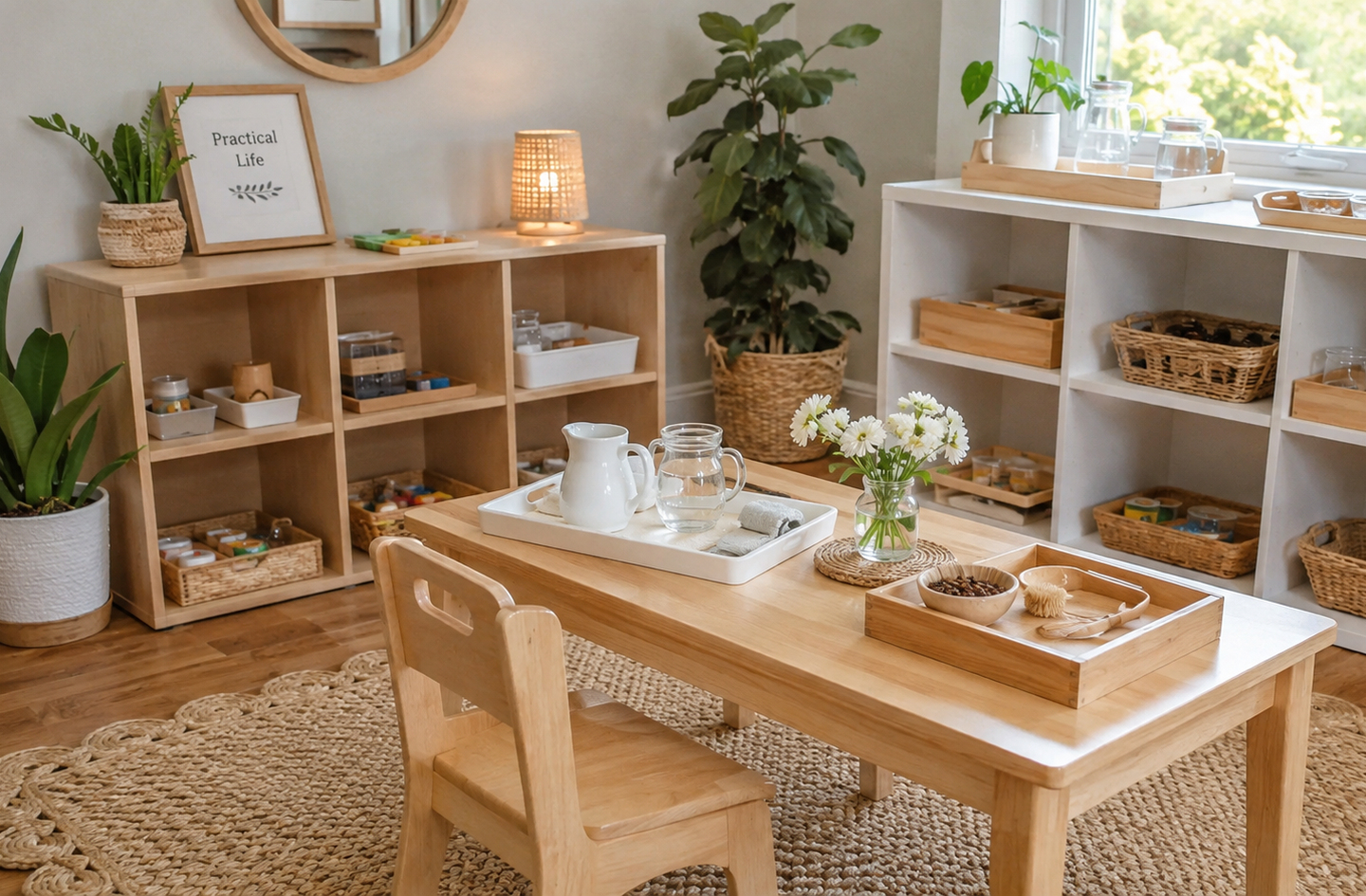
Wood is the natural starting point for Montessori environments. The grain, weight, and warmth of solid or quality-veneer wood carry visual depth without visual sharpness. A shelf in natural birch or pine reads as a single tonal object in the room. A white MDF shelf with black metal brackets reads as two distinct elements in contrast. The simpler read keeps the shelf as furniture rather than as a design focal point.
The same principle applies to small items: wooden bowls, wooden trays, wooden knobs on baskets. Wood textures are varied and interesting to touch, which adds sensory richness without adding color noise. This is part of what makes natural wood ideal for a Montessori environment: it rewards close engagement while staying quiet at a distance.
Natural Fiber Textiles and Baskets
Cotton, linen, wool, and jute bring texture to cushions, storage baskets, rugs, and curtains without the visual sharpness of synthetic materials. Natural fibers tend toward muted, varied tones because the plant fibers themselves are muted. This contrasts with the uniform, high-saturation palette of most polyester fabrics. A natural linen cushion in warm oatmeal tone adds warmth. A bright red polyester cushion adds stimulation.
Woven baskets in rattan or seagrass are ideal for organizing items on open shelves. They contain visual clutter without adding it. A collection of identically sized baskets on a shelf creates visual order and makes the contents readable. Brightly colored plastic bins, by contrast, draw attention to the storage rather than to what is inside it. The storage becomes the visual subject. How to organize back-stock and rotate what stays on the shelf is covered in detail in the overview at Montessori playroom storage.
Ceramics, Glass, and Practical Life Displays
Montessori practical life areas often include real ceramic dishes, glass containers, and small metal tools. These functional choices carry a visual benefit: real materials signal a real activity in a way plastic equivalents do not.
Step 3: Use a Rug to Define the Space, Not Style It
A rug in a Montessori playroom does two things: it defines a zone and it grounds the room’s natural palette. The right rug choice is understated – a natural jute, a soft wool weave, or a low-pile cotton in a tone that anchors the space without competing with the activities happening on top of it. The rug is the floor’s equivalent of the wall: ideally a background surface, not a focal point.
Natural Fiber vs. Low-Pile Options
Natural fiber rugs (jute, seagrass, sisal, wool) carry a warmth and texture aligned with the rest of the Montessori material vocabulary. Seagrass and sisal are durable and easy to sweep, suited for defined work areas or high-traffic circulation zones. Wool rugs offer more cushion, relevant in spaces where children sit on the floor for extended periods. Low-pile cotton rugs in neutral tones are soft and washable, a practical choice for early childhood spaces.
High-pile shag rugs and rugs with bold graphic patterns or bright primary-color repeats create two problems. They are harder for children to use as clean work surfaces when placing trays or mats. They also draw visual attention away from the activity zone and toward the floor. A rug with a subtle texture or gentle geometric pattern in muted tones does neither.
Sizing and Zone Logic
The rug should be large enough to define the primary floor-play zone clearly. A rug too small for the space creates a floating island with no relationship to the room’s boundaries. A rug too large loses its zone-defining function and simply becomes the floor.
In rooms with multiple activity areas, separate smaller rugs often work better than one large rug covering the whole space. A rug at the shelf area defines the work zone. A different rug in the reading corner signals a different mode of engagement, giving children a clear spatial cue about what each area is for.
Step 4: Get the Lighting Right Before Anything Else
Lighting is among the most underrated elements of Montessori playroom decor and one of the most measurable. A 1999 analysis of more than 21,000 elementary students across three school districts found children in classrooms with maximum natural daylighting progressed 26% faster on reading and 20% faster on math compared to those with minimal daylight exposure.3 Light shapes the room’s atmosphere and its functional quality before a single piece of furniture is placed. Getting the lighting right is an early decision, not a finishing touch.
Prioritize Natural Light First
Arrange the layout so the primary shelf and floor-work areas receive indirect natural light. Direct sun on a work surface creates glare and shadows across fine-motor activities. Indirect light from a north or east-facing window is ideal. South or west-facing windows with strong afternoon sun benefit from sheer curtains in natural linen that diffuse direct light without blocking daylight.
Keep windows clear of decorative window films or thick drapes during active hours. Natural light is itself part of the room’s visual environment. Heavy curtains pulled across a sunlit window replace natural warmth with artificial flatness. When the room has limited window access, address lighting early rather than as a finishing detail – it affects furniture placement and zone layout downstream.
Supplementary Warm-Spectrum Lamps
When natural light is limited, warm-spectrum lamps (2700K to 3000K color temperature) support the room’s natural material palette better than cool-white LEDs (4000K and above). Cool-white light creates a clinical, high-contrast environment. Warm-white light softens shadows, enriches the natural tones of wood and linen, and signals “this is a home space” rather than a workspace.
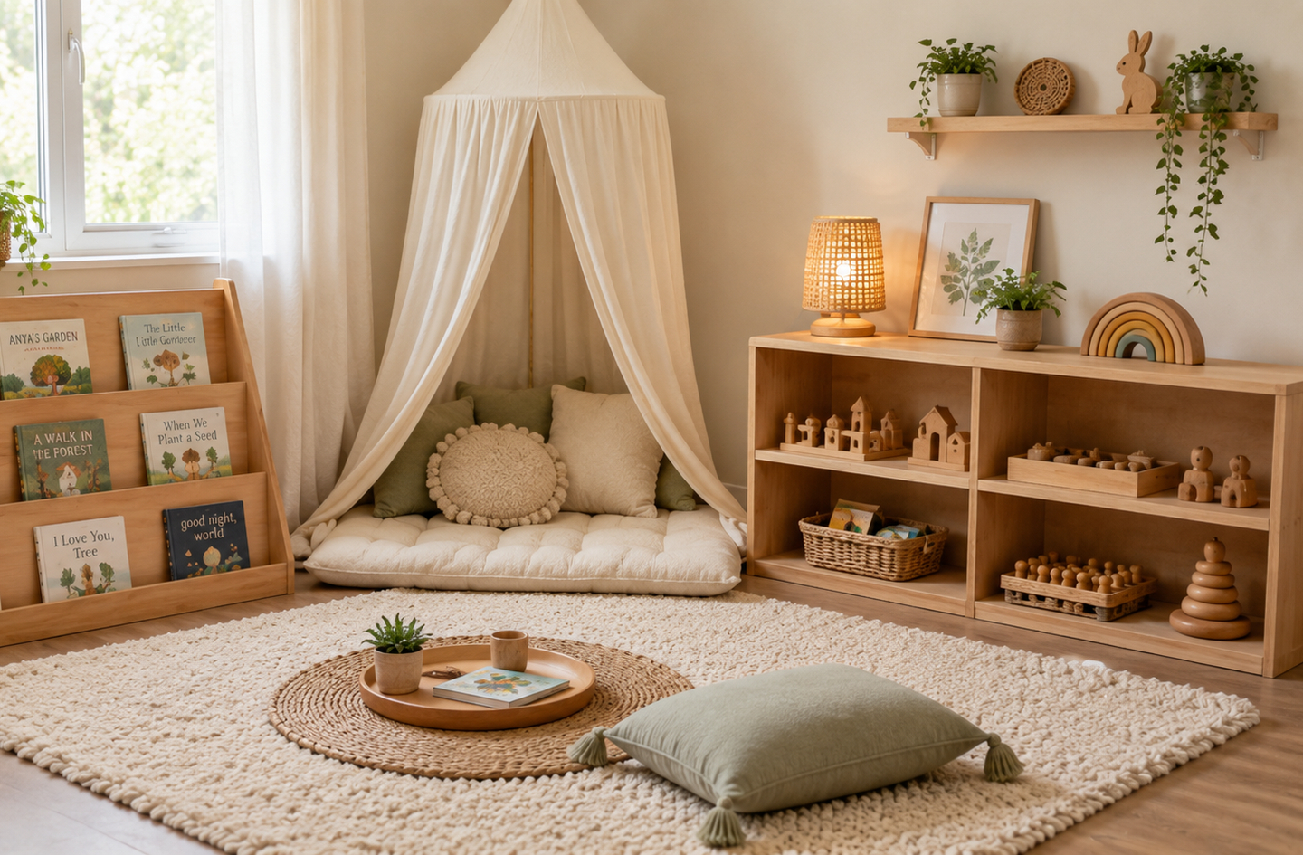
Place supplementary lamps in corners or near the floor where possible. Floor-level lighting creates visual depth and warmth in a way an overhead fixture does not. A small warm lamp near the reading nook signals the corner as a settled area without wall art or elaborate canopy work.
Step 5: Treat Walls and Vertical Surfaces with Restraint
Walls are the largest surface in most rooms and carry the most visual weight in a Montessori playroom. The evidence on this is specific: in the 2014 Carnegie Mellon study, children scored 13 percentage points lower on science tests in heavily decorated classrooms compared to sparse ones, with off-task time rising by more than 10 percentage points alongside that drop in accuracy.1 Walls are not a decoration problem to solve. They are a background to maintain.
Keep Walls Neutral and Consistent
One neutral wall color, applied consistently to all four walls, creates a visual field the shelf and its contents read clearly against. Off-whites, warm greiges, light sage, and soft terracotta all work. The rule is that the wall color reads as background, not as a design statement in its own right.
Accent walls in a contrasting color behind the primary shelf are a common mistake. The accent wall draws visual attention to itself. In a Montessori room, the shelf and what is on it should be the most visually prominent element along that wall. A competing wall color reverses the hierarchy. The child’s eye goes to the wall. The shelf becomes secondary.
What Belongs on a Montessori Wall
Very little. A low mirror at the child’s eye level serves a genuine developmental function: children observe themselves, understand their body in space, and experience their environment from their own perspective. One small piece of art at the child’s eye level – one, not a gallery arrangement – provides a visual focal point without cluttering the space. A small low shelf displaying one current-season natural collection (a pinecone, a smooth stone, a leaf) anchors the room in the natural world without overwhelming it.
The test for any wall element: does it communicate something to the child about what the space is for, or does it serve the adult’s sense of finishing the room? If it is the latter, leave it out.
Child-Height Displays and the Functional Filter
The distinction between functional visual information and decorative visual noise is the key filter for any vertical surface in a Montessori room. Functional visual information tells the child what is available or where something belongs: a low mirror, a book face-out on a low display rack, a small shelf of natural objects at eye level. Decorative visual noise adds visual stimulus without orienting the child to the space: character prints, themed borders, holiday garlands, collections of framed art positioned where only adults see them.
Child-height displays are almost always functional. Art positioned at adult height is almost always decorative noise. The distinction is not about the object itself but about where it is placed and whether the child can engage with it. A beautiful botanical print hung at the child’s eye level, where the child can look at it closely during a quiet moment, earns its place differently than the same print hung at adult height as room decoration.
How activities are presented at the child’s level on the shelf itself is covered in detail at Montessori toy shelf layout.
Step 6: Choose Textiles for Function and Warmth
Textiles bring softness and acoustic warmth to a Montessori playroom without requiring additional visual complexity. The selection principle is simple: natural fibers in tones consistent with the room’s muted palette, chosen for the function they serve rather than for visual interest on their own.
Cushions, Canopies, and Reading Nook Textiles
Floor cushions and poufs in natural linen or cotton give children soft seating at their own level. A simple cloth canopy over a reading nook – a length of natural linen or cotton attached to a ceiling hook or simple frame – signals “this is a calm corner” without elaborate construction. Knit or woven blankets folded on a low shelf are accessible, add tactile texture, and introduce warmth without visual noise.
Avoid patterned cushions with graphic prints, character fabric, or novelty shapes. A cloud-shaped cushion or a cushion printed with cartoon characters draws attention to itself. A plain oatmeal linen cushion does not. Softness and texture are enough. The cushion does not need to also be a focal point.
Curtains and Window Treatments
Floor-length linen or cotton curtains in the room’s anchor tone are the right choice. They block direct sun when needed, absorb sound, and add visual weight to the window wall without introducing a patterned element. Sheer curtains in warm white or natural linen let diffuse light through and are particularly useful in south-facing rooms where direct afternoon sun creates glare.
Avoid blackout curtains printed with patterns or characters. A patterned curtain adds visual noise to the window wall, which natural light already makes one of the room’s most active surfaces.
The Practical Limit on Textiles
A reasonable limit for a Montessori playroom: one rug, two to four floor cushions or poufs, curtains on each window, and one small lap blanket accessible from the reading corner. Beyond this, additional textiles, stacked decorative pillows, multiple layered rugs, excessive throws, begin to create visual and physical clutter the child navigates around rather than through. Less is a functional choice, not simply an aesthetic preference.
Common Playroom Decor Mistakes in Montessori Spaces
Most decor mistakes in Montessori spaces come from applying general home-decor logic to an environment governed by developmental function. The result looks styled but works against the child’s ability to move independently through the space.
Mistake 1: Themed Decor That Sets a Scene
Jungle themes, ocean scenes, space murals: entire rooms built around a visual narrative feel warm and imaginative to adults. For children under six, a themed environment often competes with the child’s own imaginative world rather than supporting it. The scene is already drawn. The child’s imagination fills a blank canvas more readily than a fully illustrated one.
One or two nature-inspired elements, a potted plant, a small stone collection, a dried botanical, ground the room in the natural world without scripting it. The child’s imagination works from there. Two elements are a prompt. Twenty elements are a crowded stage.
Mistake 2: Decorating the Wall Behind the Shelf
The wall behind the primary shelf is the room’s visual anchor. When this wall has patterned wallpaper, a bold accent color, or a gallery of prints, the shelf competes against a busy background. The activities on the shelf become harder to distinguish individually. The child has to work harder to see what is available.
Keeping the shelf wall in the lightest, plainest tone in the room ensures the toys and materials read clearly against it. This is a systems-first decision: get the visual hierarchy right, then consider whether any wall element earns its place within it.
Mistake 3: Decorating Before the System Is Working
The most common sequencing error: finishing the walls, installing curtains, and hanging art before the storage system and layout are in place. Decor applied over a failing storage system becomes part of the problem. The shelf fills with overflow, the art gets hidden behind stacked boxes, and the room reads as full rather than calm. Observation before shopping. Get the layout working, then add the minimal decor layer.
What a Visually Prepared Playroom Looks Like in Practice
A visually prepared Montessori playroom has one quality a photograph does not always capture: legibility. Walk in and your eye goes to the shelf. The walls recede. The rug grounds the space. The lamp creates warmth in one corner. Nothing competes for the child’s first glance.
The room does not feel empty. The wood grain of the shelf, the texture of the baskets, the softness of the floor cushion, and the organic shapes of the toys together provide visual richness. None of these elements shout for attention. They settle into a background against which play makes itself visible. A 2023 Campbell Systematic Review found Montessori education outperformed traditional approaches across a wide range of academic and nonacademic outcomes.4 The physical environment, including its visual and material design, is part of why.
Design for the reset, not the reveal. A room with strong visual simplicity, natural materials, and a clear visual hierarchy resets faster and stays readable throughout the day. The child always knows what is available. The parent always knows when something is out of place.
Frequently Asked Questions
What wall colors work best for a Montessori playroom?
Warm whites, soft greiges, light sage, and muted terracotta are the strongest choices for Montessori playroom walls. All four walls in one consistent tone let the shelf and activities read clearly against a quiet background. Research on classroom visual environments found children in highly decorated, color-saturated rooms scored 13 percentage points lower on learning tasks than those in simpler settings.1 The wall color should read as background, not as a design statement.
Do natural materials actually make a difference in a children’s room?
Yes, for functional reasons, not only aesthetic ones. Natural materials (wood, linen, jute, ceramic) introduce texture and warmth without the visual sharpness of synthetic finishes. Research on cognitive load and visual processing shows that fragmented, high-stimulation environments hinder simultaneous information processing and prevent meaningful learning.5 Natural materials reduce baseline visual stimulation while keeping the room sensory-rich in ways children engage with through touch and close exploration.
How much wall art is appropriate in a Montessori room?
Very little. One piece of art at the child’s eye level, placed where the child sees it during daily activity, is appropriate. A low mirror serving a developmental function earns its place. A small nature display shelf at the child’s height is functional. Everything else, gallery walls, print collections, seasonal hanging decorations, falls into the category of decor that competes with the activities on the shelf without adding value for the child.
Should I choose a patterned rug or a plain one for a Montessori playroom?
A plain or subtly textured rug in a muted, natural tone. Bold geometric patterns and high-contrast graphic rugs draw visual attention to the floor rather than to the activities happening on top of it. Natural fiber rugs in jute, seagrass, wool, or low-pile cotton in warm neutrals serve the space well. The rug’s job is to define a zone and ground the palette, both of which work best when the rug stays in the background visually.
At what height should wall elements be placed in a Montessori room?
At the child’s eye level, not the adult’s. A child between 18 months and five years has an eye level roughly 80 to 100 cm from the floor. Art, mirrors, and any small display shelf should sit within this range so the child encounters them during normal movement through the room. Elements placed at adult height serve the adult’s visual environment, not the child’s. A room where all wall elements are at the child’s scale reinforces the principle that the space belongs to the child.
Limitations and Edge Cases
- The research findings cited here come from formal classroom settings, not dedicated home playrooms. Home environments differ in adult-to-child ratios, room size, and the presence of mixed-purpose furniture. The directional findings apply, but the specific percentages reflect classroom conditions.
- This guide assumes a dedicated playroom or defined play area. In living room setups or shared spaces, the visual simplicity principle still holds but the practical implementation involves separating the play zone visually from the room’s other functions – a topic with its own distinct logic.
- The age band most directly addressed here is 18 months to six years. Older children and tweens have different visual preferences and cognitive processing capacities. The decor advice for older age transitions belongs to a different framework.
References
- Association for Psychological Science – Fisher, Anna V., Karrie E. Godwin, and Howard Seltman. Heavily Decorated Classrooms Disrupt Attention and Learning in Young Children. Psychological Science, Carnegie Mellon University, 2014.
- Wiley Online Library – Godwin, Karrie E., Audrey J. Leroux, Howard Seltman, Peter Scupelli, and Anna V. Fisher. Effect of Repeated Exposure to the Visual Environment on Young Children’s Attention. Cognitive Science, 2022.
- National Center on School Infrastructure – Heschong Mahone Group. Daylighting in Schools: An Investigation into the Relationship between Daylighting and Human Performance. Pacific Gas and Electric Company, 1999.
- PubMed Central – Randolph, Justus J. et al. Montessori Education’s Impact on Academic and Nonacademic Outcomes: A Systematic Review. Campbell Systematic Reviews, 2023.
- Springer Nature – Understanding the Cognitive Cost of Multimedia Learning: Effects of Visual Load and Language Proficiency. Cognitive Research: Principles and Implications, 2025.
Conclusion
Montessori playroom decor is not a style category. It is a set of deliberate choices about visual calibration: what the room asks the child’s brain to process before a single activity is touched. A muted color palette, natural materials, a functional rug, warm light, restrained walls, and minimal textiles all reduce background visual demand and leave attention available for play. The activities on the shelf become the most interesting thing in the room because nothing on the walls, floors, or curtains is competing with them.
The sequence matters: layout and storage first, decor second. A room with the right shelf, the right zones, and the right floor space supports the prepared environment regardless of what the walls look like. Decor done last, and done with restraint, keeps it that way. For the full framework behind these choices, see the overview at Montessori playroom setup.